Non-Hodgkin's Lymphoma Infographic
2020-08-07
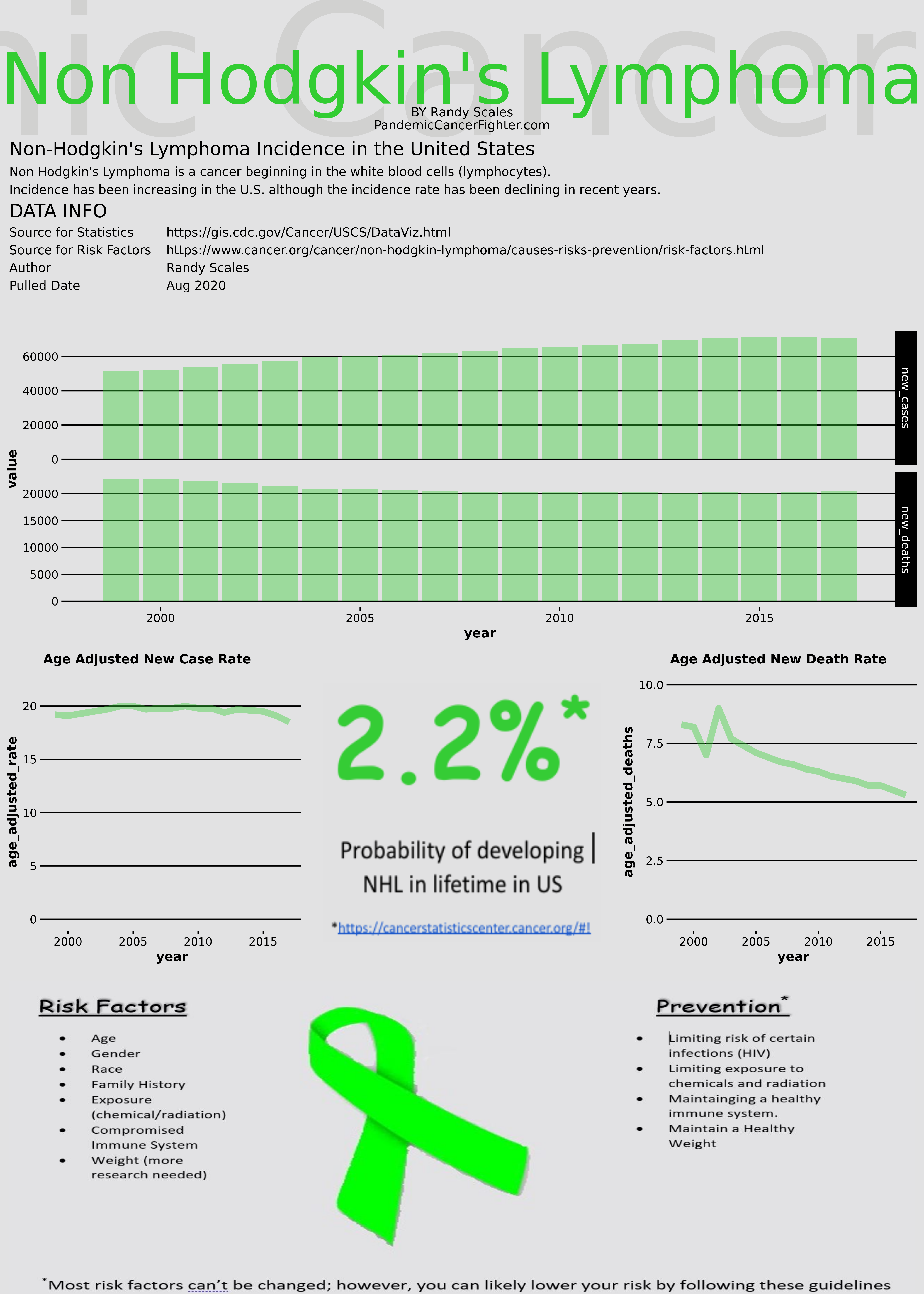
I am currently taking courses toward a health science degree. I had an assignment to create an infographic for a health related topic. What better topic than Non-Hodgkin’s lymphoma? I decided to use R to create the infographic. The text at the bottom was just created in Word and imported as an image. Big thanks to this blog for providing a great starting point for creating an infographic in R: https://alstatr.blogspot.com/2015/02/r-how-to-layout-and-design-infographic.html
I’ve also included the code below for anyone interested in creating infographics in R.
Non-Hodgkin’s Infographic
R CODE:
library(grid)
library(dplyr)
y1 <- round(rnorm(n = 36, mean = 7, sd = 2)) # Simulate data from normal distribution
y2 <- round(rnorm(n = 36, mean = 21, sd = 6))
y3 <- round(rnorm(n = 36, mean = 50, sd = 8))
x <- rep(LETTERS[1:12], 3)
grp <- rep(c("Grp 1", "Grp 2", "Grp 3"), each = 12)
dat <- data.frame(grp, x, y1, y2, y3)

year <- c(1999, 2000, 2001, 2002, 2003, 2004, 2005, 2006, 2007, 2008, 2009, 2010,
          2011, 2012, 2013, 2014, 2015, 2016, 2017)

## Age adjusted rate of new cancers
age_adjusted_rate <- c(19.2, 19.1, 19.3, 19.5, 19.7, 20.0, 20.0, 19.7,19.8,
                       19.8, 20.0, 19.8, 19.8, 19.4, 19.7, 19.6, 19.5,19.1, 18.5)

age_adjusted_deaths <- c(8.3, 8.2, 7,9, 7.7, 7.4, 7.1, 6.9, 6.7, 6.6, 6.4, 6.3,
                         6.1, 6.0, 5.9, 5.7, 5.7, 5.5, 5.3)

### of new cases
new_cases <- c(51516,52216,54050,55446,57465,59492,60338,60696,62182,63308,64889,
               65514,66776,67088,69362,70467,71516,71478,70487)

new_deaths <- c(22802,22729,22305,21910,21475,20938,20873,20593,20528,20368,
                20389,20294,20317,20388,20113,20387,20154,20268,20459)


## Population
population <- c(272809488,275879626,282115961,284766512,290107933,292805298,
                295516599,298379912,301231207,304093966,306771529,309326085,
                311580009,313874218,316057727,318386421,320742673,323071342,
                    325147121)

nh_data <- data.frame(year, age_adjusted_rate, age_adjusted_deaths, new_cases, new_deaths, population)

risk_factors <- c('Age', 'Gender', 'Race', 'History', 'Exposure (chemical/radiation)',
                  'Compromised Immune System', 'Body Weight (more research needed')

prevention <- c('Most Risk Factors Cannot be changed', 'Limit Risk of Infections (HIV)',
                'Limit Radiation/Chemical Exposure',
                'Stay at a Healthy Weight')

#A description of the health-related topic.
#Descriptive data (at least four statistics)
#Three risk factors or determinants.
#Two relevant prevention strategies specific to the target audience.
#Create your infographic using the free templates provided at piktochart.com.
#Submit your infographic as an image file (jpg, png or pdf).
#Please submit the sources for the descriptive data in APA style in a
#separate Word document.


## Great blog post helped with infographic design
## https://alstatr.blogspot.com/2015/02/r-how-to-layout-and-design-infographic.html

library(ggplot2)
library(reshape2)
library(extrafont)
library(useful)

#font_import() # Import all fonts
#fonts() # Print list of all fonts
##loadfonts()


nh_lymphoma_theme <- function() {
  theme(
    legend.position = "bottom", legend.title = element_text(family = "Impact", colour = "#CEB888", size = 10),
    legend.background = element_rect(fill = "#E2E2E3"),
    legend.key = element_rect(fill = "#E2E2E3", colour = "#E2E2E3"),
    legend.text = element_text(family = "Impact", colour = "#E2E2E3", size = 10),
    plot.background = element_rect(fill = "#E2E2E3", colour = "#E2E2E3"),
    panel.background = element_rect(fill = "#E2E2E3"),
  #  panel.background = element_rect(fill = "white"),
    axis.text = element_text(colour = "#000000", family = "Impact"),
    plot.title = element_text(colour = "#000000", face = "bold", size = 10, vjust = 1, family = "Impact"),
    axis.title = element_text(colour = "#000000", face = "bold", size = 10, family = "Impact"),
    panel.grid.major.y = element_line(colour = "#000000"),
    panel.grid.minor.y = element_blank(),
    panel.grid.major.x = element_blank(),
    panel.grid.minor.x = element_blank(),
    strip.text = element_text(family = "Impact", colour = "white"),
    strip.background = element_rect(fill = "#000000"),
    axis.ticks = element_line(colour = "#000000")
  )
}


##x_id <- rep(12:1, 3) # use this index for reordering the x ticks
##p1 <- ggplot(data = dat, aes(x = reorder(x, x_id), y = y1)) + ##geom_bar(stat = "identity", fill = "#CEB888") +
##  coord_flip() + ylab("Y LABEL") + xlab("X LABEL") + facet_grid(. ~ grp) +
##  ggtitle("Line Chart")
##p1 + nh_lymphoma_theme()

p1 <- ggplot(data = nh_data, aes(x = year, y = age_adjusted_rate )) +
  geom_line(alpha = 0.4, fill = 'limegreen', aes(y = age_adjusted_rate),  color='limegreen', alpha=0.4, size=2.4, stat = "identity" ) +
  #  geom_line(stat = "identity", aes(linetype = factor(grp)), size = 0.7, colour = "#CEB888") +
  #ylab("New Cases") + xlab("Year") +
  ggtitle("Age Adjusted New Case Rate") +
  scale_y_continuous(limits = c(0, 22))
##p2 + nh_lymphoma_theme()
p1 <- p1 + nh_lymphoma_theme()

p4 <- ggplot(data = nh_data, aes(x = year, y = age_adjusted_deaths )) +
  geom_line(alpha = 0.4, fill = 'limegreen', aes(y = age_adjusted_deaths), color='limegreen', alpha=0.4, size=2.4, stat = "identity") +
  #  geom_line(stat = "identity", aes(linetype = factor(grp)), size = 0.7, colour = "#CEB888") +
  #ylab("New Cases") + xlab("Year") +
  ggtitle("Age Adjusted New Death Rate") +
  scale_y_continuous(limits = c(0, 10))
##p2 + nh_lymphoma_theme()
p4 <- p4 + nh_lymphoma_theme()

library(data.table)
nh_incidence <- select(nh_data, year, new_cases, new_deaths)

nh_incidence_long <- melt(setDT(nh_incidence), id.vars=c("year"), variable_name='value')

p2 <- ggplot(data = nh_incidence_long, aes(x = year, y = value, group = factor(variable))) +
  geom_col(alpha = 0.4, fill = 'limegreen', aes(y = value)) + ##color='limegreen', alpha=0.4, size=2, stat = "identity", aes(size = 1, colour = "#CEB888")) +
  #  geom_line(stat = "identity", aes(linetype = factor(grp)), size = 0.7, colour = "#CEB888") +
  #ylab("New Cases") + xlab("Year") +
  facet_grid(variable ~., scales="free")
  ggtitle("New Cases per 100,000 U.S. Residents")
##  scale_y_continuous(limits = c(0, 22))
##p2 + nh_lymphoma_theme()
p2 <- p2 + nh_lymphoma_theme()


#p3 <- ggplot(data = dat, aes(x = reorder(x, rep(1:12, 3)), y = y3, group #= factor(grp))) +
#  geom_bar(stat = "identity", fill = "#CEB888") + coord_polar() + #facet_grid(. ~ grp) +
#  ylab("Y LABEL") + xlab("X LABEL") + ggtitle("radar plots")
#p3 + nh_lymphoma_theme()

library(jpeg)
library(png)
ribbon <- readJPEG('/cloud/project/risk_factors.JPG')
nhl_pct <- readPNG('/cloud/project/nhl_pct.png')

# Generate Infographic in PNG Format
png("/cloud/project/Infographics1.png", width = 10, height = 14, units = "in", res = 500)
grid.newpage()
pushViewport(viewport(layout = grid.layout(4, 3)))
grid.rect(gp = gpar(fill = "#E2E2E3", col = "#E2E2E3"))
grid.text("Pandemic Cancer Fighter", y = unit(1, "npc"), x = unit(0.5, "npc"), vjust = 1, hjust = .5, gp = gpar(fontfamily = "Impact", col = "#A9A8A7", cex = 12, alpha = 0.3))
grid.text("Non Hodgkin's Lymphoma", y = unit(0.94, "npc"), gp = gpar(fontfamily = "Impact", col = "#32cd32", cex = 4.6))
grid.text("BY Randy Scales", vjust = 0, y = unit(0.91, "npc"), gp = gpar(fontfamily = "Impact", col = "#000000", cex = 0.8))
#grid.text("Pandemic Cancer Fighter", vjust = 0, y = unit(0.913, "npc"), gp = gpar(fontfamily = "Impact", col = "#000000", cex = 0.8))
grid.text("PandemicCancerFighter.com", vjust = 0, y = unit(0.90, "npc"), gp = gpar(fontfamily = "Impact", col = "#000000", cex = 0.8))
##print(p3, vp = vplayout(4, 1:3))
grid.raster(ribbon, vjust = 0.32, y=unit(0.072, "npc"), width = 0.98, height = 0.25)
print(p2, vp = vplayout(2, 1:3))
print(p1, vp = vplayout(3, 1))
#print(grid.raster(nhl_pct),  vp = vplayout(3,2))
grid.raster(nhl_pct, vjust = -1, y=unit(0.072, "npc"), width = 0.3, height = 0.2)
print(p4, vp = vplayout(3, 3))
grid.rect(gp = gpar(fill = "#E2E2E3", col = "#E2E2E3"), x = unit(0.5, "npc"), y = unit(0.82, "npc"), width = unit(1, "npc"), height = unit(0.11, "npc"))
##grid.text("CATEGORY", y = unit(0.82, "npc"), x = unit(0.5, "npc"), vjust = .5, hjust = .5, gp = gpar(fontfamily = "Impact", col = "#CA8B01", cex = 13, alpha = 0.3))
grid.text("Non-Hodgkin's Lymphoma Incidence in the United States", vjust = 0, hjust = 0, x = unit(0.01, "npc"), y = unit(0.88, "npc"), gp = gpar(fontfamily = "Impact", col = "#000000", cex = 1.2))

grid.text("Non Hodgkin's Lymphoma is a cancer beginning in the white blood cells (lymphocytes).", vjust=0, hjust=0, x=unit(0.01, "npc"),y=unit(0.864, "npc"), gp = gpar(fontfamily = "Impact", col = "black", cex = 0.8))

grid.text("Incidence has been increasing in the U.S. although the incidence rate has been declining in recent years.", vjust=0, hjust=0, x=unit(0.01, "npc"),y=unit(0.85, "npc"), gp = gpar(fontfamily = "Impact", col = "black", cex = 0.8))

grid.text("DATA INFO", vjust = 0, hjust = 0, x = unit(0.01, "npc"), y = unit(0.832, "npc"), gp = gpar(fontfamily = "Impact", col = "black", cex = 1.2))
grid.text(paste(
  "Source for Statistics",
  "Source for Risk Factors",
  "Author",
  "Pulled Date", sep = "\n"), vjust = 0, hjust = 0, x = unit(0.01, "npc"), y = unit(0.776, "npc"), gp = gpar(fontfamily = "Impact", col = "#000000", cex = 0.8))
grid.text(paste(

  "https://gis.cdc.gov/Cancer/USCS/DataViz.html",
  "https://www.cancer.org/cancer/non-hodgkin-lymphoma/causes-risks-prevention/risk-factors.html",
  "Randy Scales",
  "Aug 2020", sep = "\n"), vjust = 0, hjust = 0, x = unit(0.18, "npc"), y = unit(0.776, "npc"), gp = gpar(fontfamily = "Impact", col = "#000000", cex = 0.8))
##dev.off()